Travel Landing Page
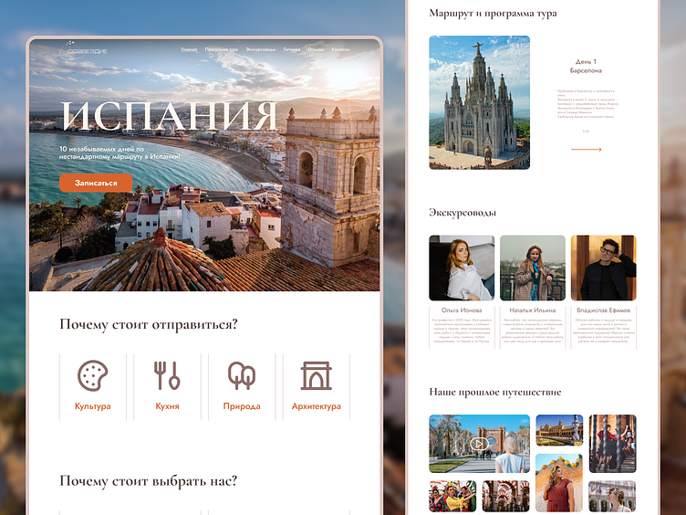
This landing page is designed to sell a tour to Spain.
Pastel tones of brown were used in the design - as a symbol of the basic tones of Spanish architecture. As an accent: deep orange - a reference to the color of the roofs of Mediterranean houses.
Thanks for watching, liking and commenting! 🤞
More by Aleksei Vdovin View profile
Like
