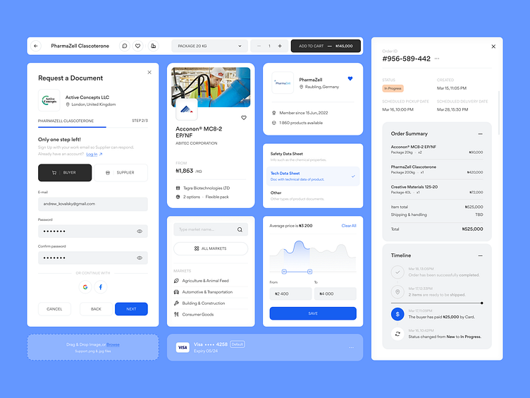
UI-kit design for b2b e-commerce platform | Lazarev.
Dribbble community, have you been keeping up with our Matta case? 💙
We’re continuing to break down the chemical products' marketplace design, and in today’s menu are order details and checkout.
If your payment page takes too many steps or has friction stopping users from completing an order, or is confusing overall, things can look not so great for your conversion rate. Because if customers struggle with finalizing their purchase, they can leave and never come back 😧
Order details are as vital. Depriving customers of a clear understanding of serious purchases like chemicals and raw materials can lead to a lack of user trust and satisfaction, hence, a drop in sales.
To help Matta avoid any of these risks, we went for a straightforward and high-converting order and checkout page design 📈
Our team fused a clear and well-structured layout with self-explaining icons, graphs, bold buttons, and UX copy to ensure users move to finalize their purchase and have all the order information they need.
How do you think we did? Share your thoughts on this UI&UX design.
❓ Looking for a team for an informed and high-converting marketplace website design? Search no further – let’s discuss how we can help you at hello@lazarev.agency.
Website | Facebook | Behance | Linkedin | Instagram | Twitter


