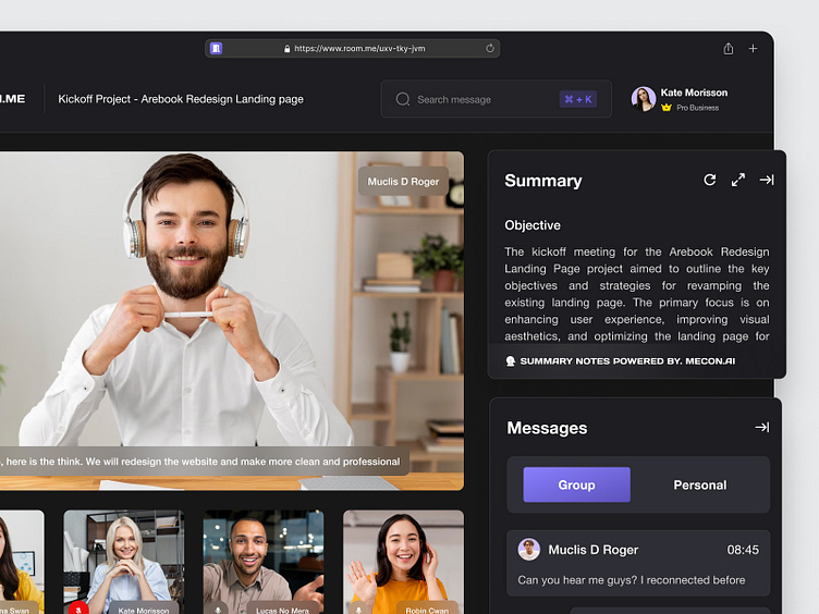
Room.me - Video Conference Dashboard 📹
Hello, Dribbble! 😁
Today I'd like to share my new exploration of a Project management Dashboard called Promax. Don't forget to scroll, to see full of my work
I hope you guys enjoy it and press "L" if you like it😉Any feedback or comments? Feel free to leave comments below. Have a unique project? Please send it to our email:📧hellopickolab@gmail.com
Product Overview 👀
Room.me is an innovative video conference product that revolutionizes virtual meetings. With its user-friendly interface and advanced features, Room.me provides a seamless and immersive video conferencing experience. The product ensures crystal-clear audio and high-definition video quality, facilitating effective communication and collaboration among remote teams and participants. Room.me supports real-time screen sharing, file sharing, and interactive whiteboarding, enabling seamless presentations and brainstorming sessions. The platform's unique virtual room setup allows participants to move freely, facilitating natural interactions and enhancing engagement during video conferences. With Room.me, virtual meetings feel like in-person interactions, fostering productivity and meaningful connections across the globe.
Challenges ♟️
Make the dashboard dark mode and combination with my previous shot about AI
Result: This result of the design is I make the combination of my shot before about Summary notes AI and implemented it in Dashboard, the users can refresh the summary if the summary does not match with theirs and can expand the summary. After that, I separated the messages have two tabs, for Group or Personal like Zoom.
Have a unique project?
Contact Us!
Our Product on the Marketplace
UI8 | Uplabs | Creative Market | Gumroad | Envato


