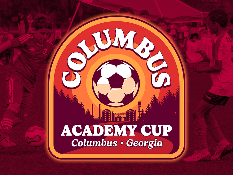
Columbus Academy Cup, event logo
The Sports Council at Columbus, Georgia asked Snap Soccer to create a new event for their underused soccer facility. Based on the time of year, it was decided to offer an event for younger teams (U9 to U15), since older kids would already be consumed by high-school soccer. My approach to this new event's brand was to be warm, friendly and "Columbus-y". Most sporting event logos use hard, modern san serifs hoping to instill a since of performance and excellence. I chose to go the opposite direction picking a font that's rounded, full and inviting. I combined this with a warm color palette that's almost nostalgic, reminding me of western movie posters from the 60s. And finally, the nod to Columbus's identity came in the illustrated background which combines a silhouette of the industrial era of the city, cradled between tall pine trees and a winding river (the Chattahoochee River). I believe the design could hold up without the city and state in the design. But because this is a new event, I wanted our followers to easily understand where the event takes place.
