HydroLight
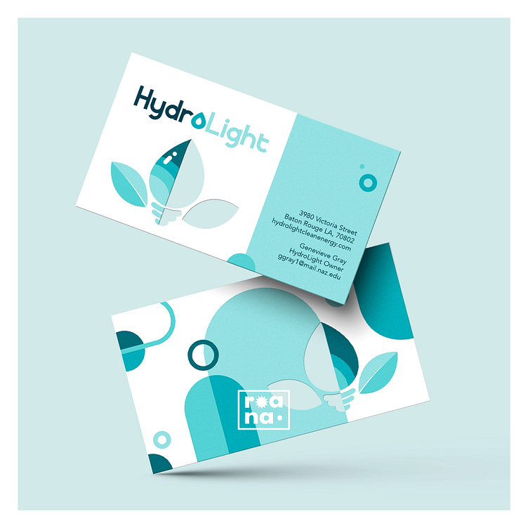
One of my graphic design projects at Nazareth, “HydroLight” was born from the simple, random prompt of a hydroelectric company. Each student was tasked with creating a brand identity and stationary system for an imaginary company in a seemingly mundane industry.
Our stationary sets were required to contain a business card, so I took the opportunity to explore the utilization of die-cutting technology. The business card mockup was edited by me to create the logo-shaped die cut, allowing my professor and classmates to truly envision my concept.
The concept behind my imaginary company was the merging of clean energy, water, and electricity. Electricity can take many forms, but I chose to focus on a lightbulb because of the positive connotations associated with light or brightness. The rest of the identity developed around this: monochromatic blue for water and cleanliness, sans-serif fonts for modernity, and a floral shape with leaves for nature.
For more information, find me here:
✦ https://linktr.ee/roana.arts
✦ https://roanaartanddesign.com/
🚫 Do NOT repost/sell/trace/use my work! No NFTs or AI! 🚫


