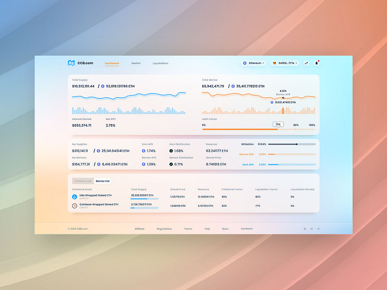
UI UX Dashboard Design for Cross Chain DeFi Web3 Bridge Wallet
Hey dribbblers!
We are happy to share the UI/UX dashboard design of our latest Cross Chain Bridge Wallet concept. Our main goals were to improve the UX, deliver consistent UI design of the platform, and work with color branding of each blockchain featured on the CCB concept. We offered the client several solutions to enhance the user experience, slightly modified the UI, and provided a non-trivial look of all chains on the light and dark platform themes. For the purpose of simplicity, we offered a lightweight and minimalistic design with all the necessary functions. Thus, the web application meets all the customers’ requirements and matches the target audience's request.
Be sure to follow the @Extej team for regular updates. Do you have a project you’d like to collaborate on?
You can also buy this template. Feel free to contact us by: Email or Telegram
Dribbble | Instagram | Behance | Facebook
We are always open and available for new projects!
Your feedback is very appreciated! Don't be greedy and press "L" or ❤️ if love it
