Logo for physiotherapy mobile app
Behance Case Study >>
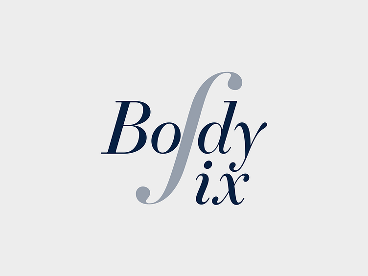
We created logo and branding for the online physiotherapy platform. 🧘🏼
The central shape resembled a spine, symbolizing strength and resilience. Moreover, it also bore resemblance to a part of the treble clef, representing harmony. The italicized font used in the logo added a touch of fluidity and reflected the movement of the human body, evoking emotions of elegance and sophistication. ⭐️
• • • • •
Looking to elevate your digital presence with top-notch UX/UI or branding? We'd love to collaborate with you! Feel free to reach out and let's bring your vision to life together. 🎉
• • • • •
Show us some love! Press "L".