Profile
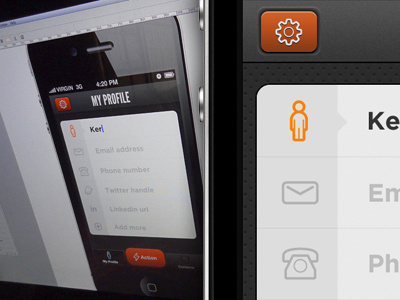
So I got rid of the huge round button as it became very problematic vertical height wise... Moved towards more of a conservative style with that call to action button. On this screen we're taking a peek at a simple form. I guess we can agree no one likes the standard iOS form elements :)
Feedback is as always appreciated.
PS: Still thinking about making that action button dark color like the previous shot... Not sure.
