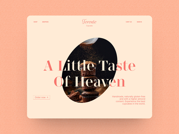
Toronto Cupcakes - Redesign
Problem
Toronto Cupcake website is ranked first in the first page of google search, however the website lacks of :
operational simplicity
strong branding
effective use of visual elements
Let's discover their website
Toronto Cupcakes
The Hero Section
No Branding, Logo and pictures look like were downloaded from Google Image.
No hierarchy, all the texts have the same font size.
No CTA, there’s no button that allows us to buy or discover products.
no nav bar, Hamburger menu are not made for website breakpoint
The shop page
Pictures are not appealing.
No dropdown list to choose the quantity.
Prices are not shown.
No filter, you have to scroll down to see other custom cupcakes.
Let’s create some changement!
Branding
The logo is minimal, modern with pink variations—matching the color of the website. Salmon is a blend of pink with a touch of orange. Its shade is just a bit on the lighter side of living coral. Since pink is Salmon's base color, Salmon is seen as a color of hope, health, and happiness.; all of which are the characteristics we want users to associate with Toronto Cupcake.


