Finding Balance Unveiling Lee Oosthuizen's Rebranding Typography
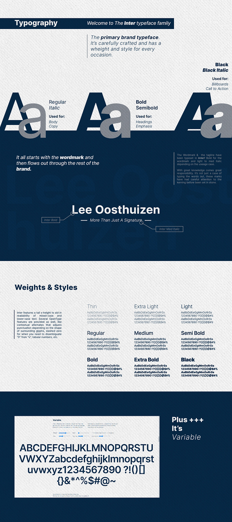
Presenting a pivotal aspect of Lee Oosthuizen's rebranding journey – the typography! The wordmark and tagline are beautifully typeset in Inter, which serves as the primary typeface for the entire brand.
I have carefully selected Inter's versatile weights to harmonize with different elements and maintain a consistent look and feel. The tall x-height enhances legibility, ensuring a smooth reading experience for mixed-case and lower-case text.
With meticulous attention to detail, Inter underscores the brand's pursuit of excellence. Embrace the power of Variable Typography as we get closer to the vision of a balanced, refreshed identity. Stay tuned for more updates as the journey unfolds!
Hit L to support!
___________________________________________________________________________________
___________________________________________________________________________________
Ready to talk / Start a Project ?🚀
Feel free to reach out via Dribbble DM or E-mail:
👉 brendonmcintosh@design-inc.co.za
🛒 Buy my design assets on creative market
