PAN ME menu | by Bean Creative
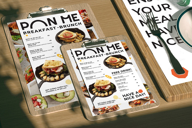
Our team at Bean also devised a bright, vibrant color palette that works in tandem with the logo. Ferrari red was used as the primary hue, while amber, flavescent and sea green act as complementary colors. These warm, flamboyant tones impart the dynamic, energetic personality of Pan Me. Using Montserrat as the primary typeface, the solid font adds in a touch of generosity, trustworthiness and modernity.
