PAN ME logo | by Bean Creative
Happiness begins with a leisurely breakfast. Sometimes we just want to stray away from the rush, wake up a little late, look for something fresh for the day. Responding to that insight, Pan Me, a brunch spot in Da Lat, was founded.
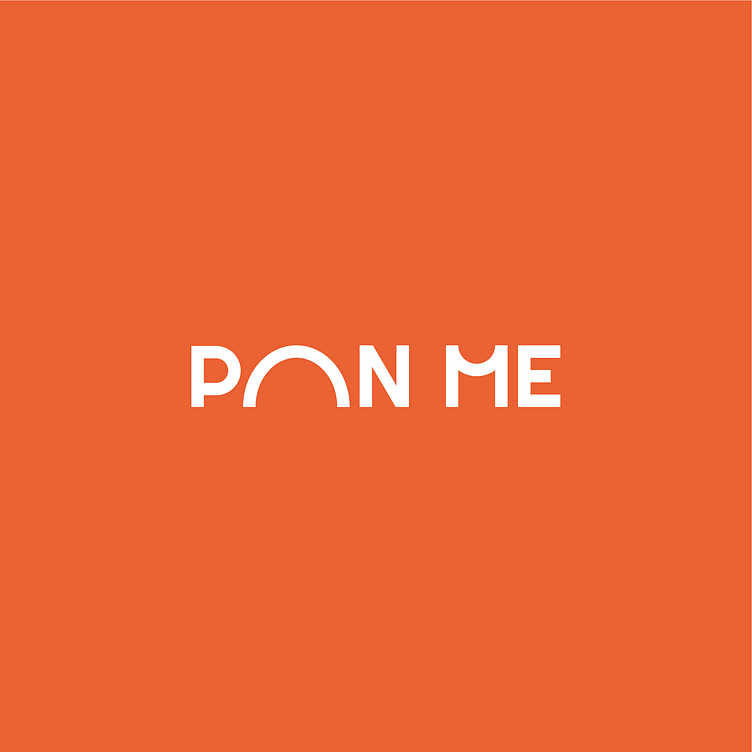
Simple yet impressive, the “A” in the wordmark was stylized into a half-circle, alluding to a pan, amplifying Pan Me’s signature. Also, it suggests Gothic arches, which are employed commonly in European architecture, bring out the Western origin of the food. Accordingly, the middle strokes of the letter “M” were bent into another semicircular curve, making the general composition balanced and more eyecatching. Altogether, the logomark speaks boldly and openly to its audience. It’s where classic meets modern, aspiration meets fun, and passion meets whimsy.
