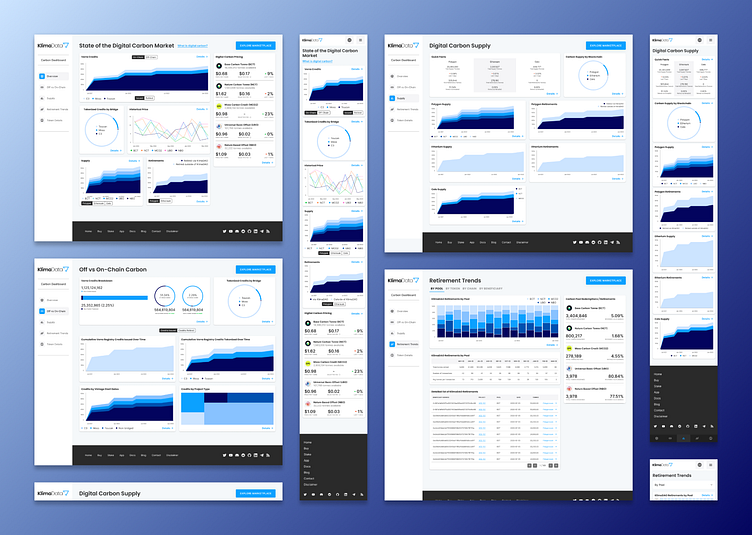
KlimaDAO's Carbon Dashboard
Research
Before I joined the team at KlimaDAO, they already had some great bones to this product. In essence, the Carbon Dashboard was meant to provide a source of industry reference for scholars, reporters, and carbon brokers to gather information on the price, supply, and retirement activity of carbon- both on and off the blockchain. Here's what it looked like before I got my hands on it:
As you can see, they had some good bones. The dashboard provided the information they wanted to provide. albeit a little less pretty than we would have liked. So we reached out to some of our most frequent users and set up some interviews to ascertain:
How exactly they use the data in the dashboard
What specific information is most useful to them
Any pain points in the user journey of seeking out a specific piece of information they might be looking for on the dashboard.
After half a dozen interviews it became quite clear that the users viewed the graphs and charts as somewhat visually juvenile. The users also felt that the information within the dashboard was redundant and duplicated in many areas (one could find the same information spread across multiple charts in several different areas of the dashboard). Finally, the data we presented in the dashboard lacked analysis and context.
Prototype
After reviewing the information we cultivated from the user interviews, I composed a list of design requirements and a few user stories. After a about a week of internal iterations, I had a new dashboard with better organized data, an improved graphing library, and plenty of space for some real-time AI-generated analysis of each graph on the dashboard. I began work scheduling some usability tests while our head of product began training a ChatGPT bot to provide the real-time data analysis.
With an improved graphing library, we were able to make each of these graph cards interactive. Users could click on graph points and receive information. They could also interact with the graph legend to single out specific lines or bars to view.
On this screen, the user can see a graph in expanded detail, with real-time AI-generated insights below.
Testing
Testing yielded a few useful insights. Here they are:
The most natural place for a user to see and interact with a graph legend is the bottom center of the card that contains the graph (see image below).
For graphs that show parallel information (for example, Graph A shows the supply of carbon credits off-chain and Graph B shows the supply of carbon credits on-chain), the easiest way for a user to compare these graphs is to place them on the same card, navigated by a segmented button / toggle switch (see image below).
The "Details" button on each graph card that leads a user to more in-depth info is easiest for a mobile user to tap when at the top right of the card on mobile. The interactive legend at the bottom crowded the tap targets (see image below).
We still had some redundancy / duplication in the data, so we combined a few graphs and relocated them to a place that made more sense to the users.
In the photo above, we see the graph legend placed at the bottom of the card, mentioned in point 1. And the interactive segmented button mentioned in point 2.
In the photo below, we see the mobile version with the "Details" button on the top right.
Final Result
After implementing the feedback and results from the usability testing, the last step was to imbue the designs with a bit of color to liven things up and help differentiate between data points on this graph-heavy dashboard. I'm quite passionate about making data accessible to all users, so I took great length to ensure that anyone experiencing any type of color blindness would still be able to read and understand the graphs. I took a mono-chromatic approach to the color theme and made sure that each color variable used in the graphs had at least 20-30% luminosity variance. So someone with the most severe case of monochromacy, for example, can still see major and detectable differences in the varying shades of blue.
Check out the final result at carbon.klimadao.finance.


