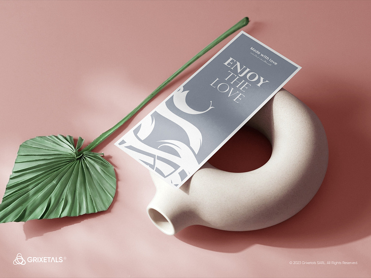
Jouri Flower Shop Identity
Jouri Flower Shop | Brand Identity
Lebanon 2020
At Jouri Flower Shop, we believe roses are the timeless symbols of love, tenderness, and exquisite beauty—an eloquent expression of one's deepest emotions, especially love. Keeping this essence in mind, we set out to craft a contemporary and captivating logo that embodies these concepts.
Drawing inspiration from free Arabic calligraphy, we meticulously shaped clear letters to convey elegance and intricate details in a simple yet striking manner. The logo's circular layout reflects the grace of a blooming rose, while zigzag paths symbolize the fluidity and movement of petals. Delicate details, such as branches, add a touch of authenticity.
Color selection played a pivotal role in shaping our visual identity. The choice of Terra Cotta, a gentle shade of orange, holds profound significance as it evokes the essence of roses and nature. This unique and distinguished hue positions us as a strong competitor in the market. The color orange, with its connotations of warmth, passion, joy, and sociability, harmoniously supports our brand's purpose and vision.
What do you think? your feedback are much appreciated! 🔥
Designed with Deep Imagination 💫
©️2023 Grixetals Space, All Rights Reserved.
Feel free to reach out via DMs or E-mail:
and let's unleash our imagination!
Follow us on Instagram for more.


