Sito E-Commerce Brand Design: Youthful & Trendy Multinational Pl
About
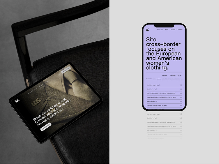
Sito Cross-Border is a company focused on the European and American women's fashion industry. Leveraging China's supply chain capabilities, it meets the demands of external market customers and benefits the "operators," "Sito Cross-Border's affiliated companies, business partners, and customers" in a three-way partnership.
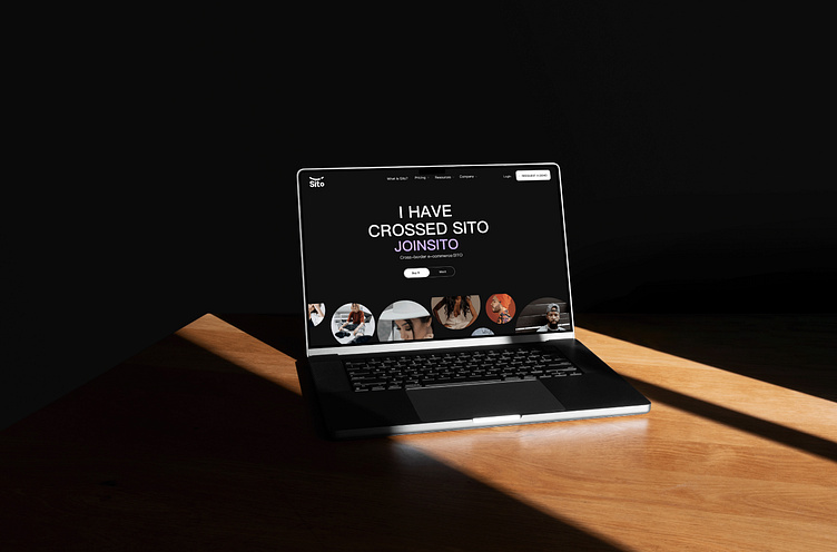
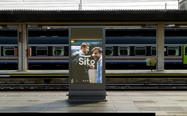
Moving away from the traditional agency model, the company provides technical support and solutions. As the company aims to expand its market influence and gain recognition among competitors, it developed this visual design to enhance credibility and further professionalize the brand.
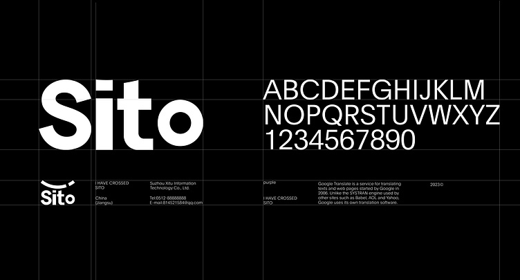
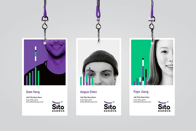
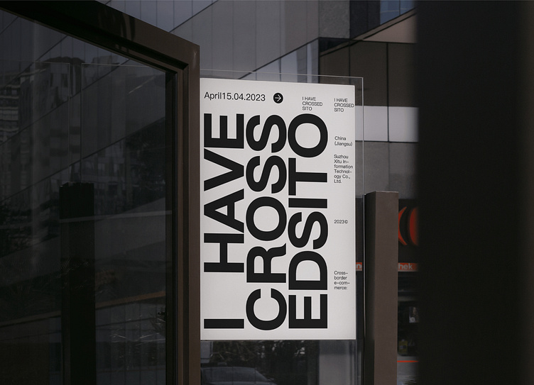
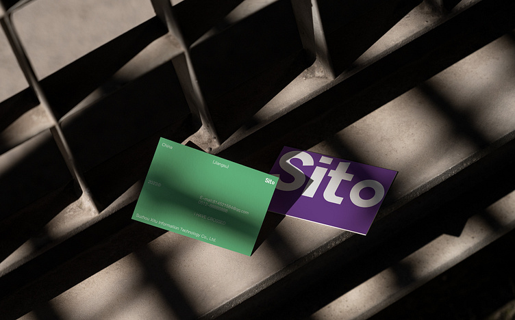
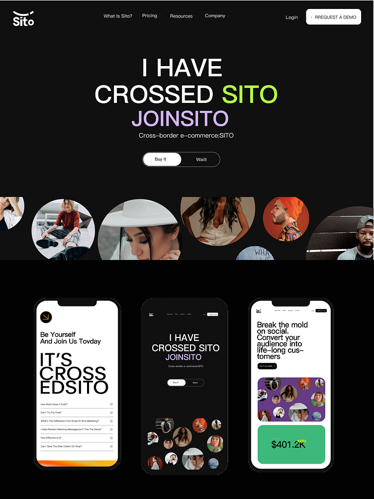
Based on the characteristics of cross-border e-commerce and factors like fashion incubation, we propose a primary design concept that emphasizes youthfulness and trendiness. Therefore, for the choice of brand colors, we have selected purple and green as the main tones, creating a contrasting color scheme that stands out more compared to traditional monotonous corporate colors. When combined with the logo, it will generate a stronger point of remembrance.

#brandidentity #webdesign #ecommerce #logodesigns #branddesign
Follow resaucedesign @Behance @Instagram @ Dribbble
Email us: rachelfinds10@gmail.com
Wechat us: resaucedesign
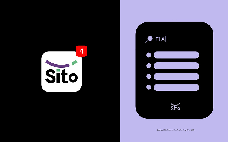
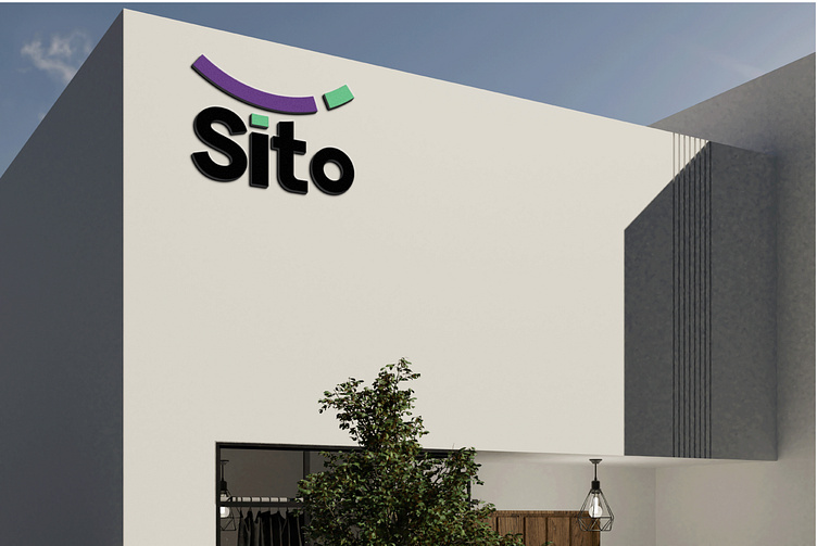
In the logo design, the main focus is on the integration of graphics and English text, with the graphic representing a minimalist concept of a smiling element. A smile gives a warm feeling, which, to a certain extent, reflects Sito Cross-Border's attitude of humility and responsibility when providing services to its "affiliated companies, business partners, and customers."
#brandidentity #webdesign #ecommerce #logodesigns #branddesign
Follow resaucedesign @Behance @Instagram @ Dribbble
Email us: rachelfinds10@gmail.com
Wechat us: resaucedesign