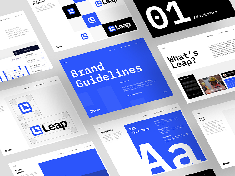
Leap - Visual Brand Identity
Hello everyone! 👋
The logo design for Leap Website ingeniously combines the "L" alphabet, resembling stairs that signify rapid development towards the digital era. With a professional touch, this emblem captures the essence of progress and growth, perfectly representing Leap's commitment to excellence in the digital realm.Cheers! 🤙
Overview
Welcome to Leap Website, where innovation and progress converge in a symbol of excellence. Our logo, creatively crafted with the "L" alphabet forming stairs, represents rapid development towards the digital era, while maintaining a professional impression that embodies our commitment to delivering exceptional services and embracing the dynamic world of technology.
Thanks for checking it out!
Interested in partnering with us?
Say hello at hellodama@odama.io
or visit our website odama.io
Check us more at:

