Fission Logo

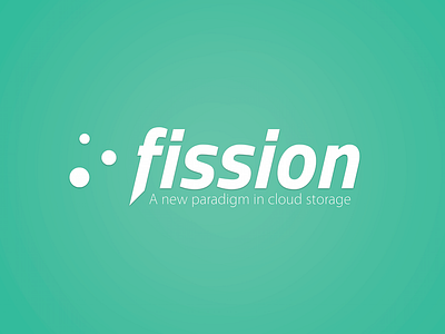
A logo I made a few months ago for a now-defunct decentralized cloud storage service called Fission. The project was a byproduct of some hacking done at CalHacks out in Berkeley last year. Due to the decentralized nature of the product, we called it Fission in reference to nuclear fission. As a result, the three dots next to the logo signify three free-floating electrons.
Fonts used: Titillium Bold Italic (Modified), Vegur Light