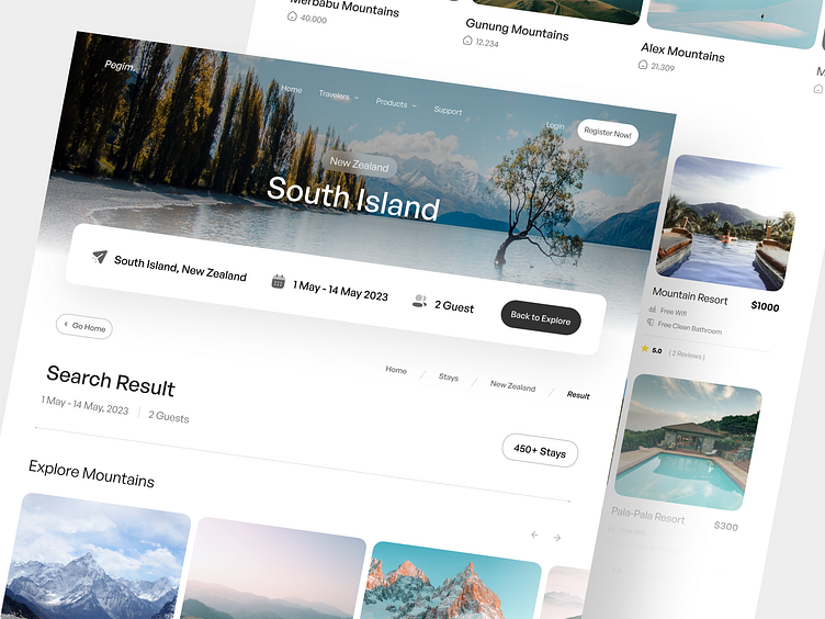
Pegim. | Search Result Page
Hi World! 👋🏻,
Today I want to share with you the concept of a Pegim - Search Result Page
This exploration I designed the layout of the search results page by adjusting the style applied in the previous design. I tried to arrange and adjust each element to remain consistent in this design such as divider lines, breadcrumb elements and cards.
And the challenges I had to face in this exploration were:
Consistency: in Pegim, I made sure that every element is consistent with other pages to create a good brand quality in Pegim in the eyes of users.
Minimalistic Design: Minimalistic design prioritizes content as the center of attention. By reducing redundant visual elements, it's easier for users to focus on the information and message being conveyed. This helps increase comprehension and interaction with the content presented.
Neat Layouting: With a clean and intuitive layout, users can easily navigate the website and find what they are looking for. Judicious use of white space also helps to create a more comfortable and inviting look.
Full Preview
What do you guys think?
Let me know in the comments section!
🫶🏻 Press "L' to show some love and to share your comments in the section below
📧 Have a project idea? We are available for
New Projects moehammadfarizi10@gmail.com | Instagram


