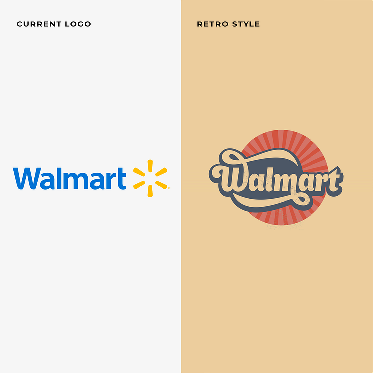
Walmart logo retro style
Step Back in Time with Walmart's New Retro Logo: A Journey to Vintage Vibes!
Redesigning the Walmart logo in a retro style could be a captivating choice that complements the brand's current meaning.
Embracing a retro aesthetic would tap into nostalgia, reminding customers of Walmart's longstanding presence and successful history.
The vintage-inspired design could infuse a sense of familiarity and warmth, reinforcing the brand's commitment to trust and reliability. Utilizing vibrant colors and classic typography may evoke a sense of optimism and affordability, aligning with Walmart's customer-centric approach.
By blending the retro charm with their modern identity, the redesigned logo would create a delightful and memorable shopping experience, appealing to a broader audience while maintaining Walmart's reputation as a leading retail giant.
We're available for brand identity design projects
Please share your thoughts about this. And don’t forget to Press “L” 💙 to support our shot.
