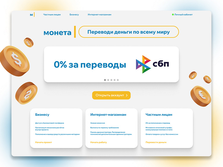
landing for fintech service Moneta Labs, concept
Why does it look like this?
The main goal was to be clean and understandable. It is always crucial for a financial industry.
So we use clean interface, minimum elements, strict structure and text order. 3D objects add a bit of depth and fulfill the space.
Main screen explains essential feature of the product
Provides call-to-action
Relevant promotion
Leaves space for future improvements and animation
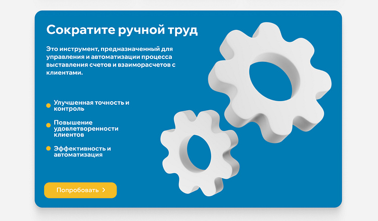
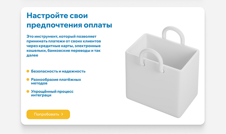
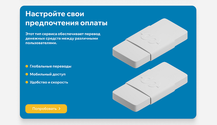
Product card design
Next cards provide more info about every service.
Minimum text
Spacious
CTA
3D objects give opportunity to scan info