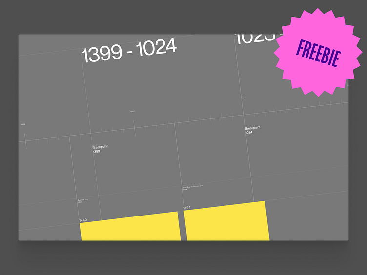
Webdesigner Freebie - Breakpoints
Hi all! A little advice and a freebie this time.
I used to define breakpoints as a single value: 320, 768, 1024, and so on, without actually thinking about it as a range, rather than a single value.
What I mean by this: it's important to realise your design is not only seen at whatever you design it on (1440px for example).
And even if you design for several devices (mobile, tablet, desktop), you gotta think about when a breakpoint starts and ends. Will this font size I've picked for mobile, look good at the very smallest size (320px?) and at the very largest size (600px?). Will my desktop design still look great at 1920? or even 2560px?
To help you think about this more often, and even visualize this, I've created this Figma overview.
It's actually a must have for communication between designer and developer, but I noticed it also helps me think about the design in different sizes better and more often.
Download link: https://www.figma.com/community/file/1259401981203943801/Breakpoint-Overview-(Freebie)
