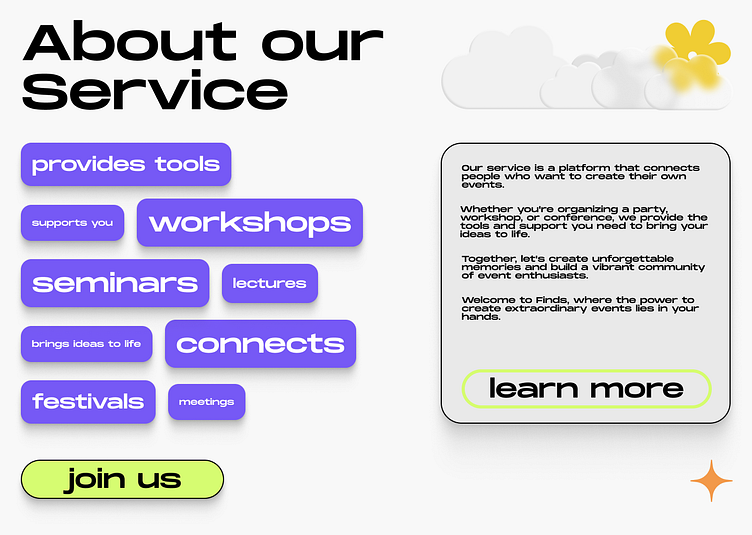
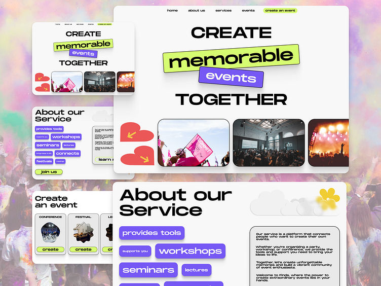
Website for event organization service
Challenge:
Create a shot with screenshots of the desktop landing of a service that brings people together to create their events. Focus on the "About Us" section to show the service's identity, graphic elements, work with typography along with graphic elements.
Target audience:
Active people 20-35 years, involved in event creation and familiar industries.
Why does it look like this?
The website is spacious and light in order to leave more space for photos and interactive information.
Clear call to action buttons, which lead to one goal – launching your own event.
Accent colors – neon green and light violet. They attract attention and create a nice contrast to the black typography and white background.