GF Recommendation #2 🚀
Growth Formers Recommendation #2 🚀
Brand: dockatot.com 👶
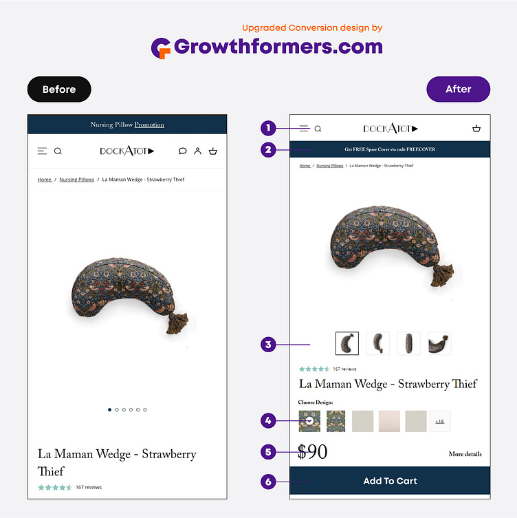
1. Streamlined the Logo Area for Enhanced Clarity: Revamped the logo area to create a clear and concise visual representation.
2. Revamped the Announcement Bar for Improved Conversions: Enhanced the visibility of the announcement bar and made the offer more prominent.
3. Comprehensive Display of Product Angles: By showcasing multiple angles and images of the product, conversions are enhanced.
4. Elevating Options Above the Fold: By strategically placing all color and design selections above the fold, user interaction and engagement are significantly increased.
5. Emphasizing the Significance of Price: By prominently featuring the price above the fold, its importance is acknowledged and draws immediate attention from potential customers.
6. Placing the Add-to-Cart Button as the Primary Call-to-Action: To maximize conversions, it is essential to position the Add-to-Cart (ATC) button above the fold, ensuring easy visibility and accessibility for users. Neglecting this crucial placement could potentially harm conversion rates.
