Audible App Submit Button UX/UI Design
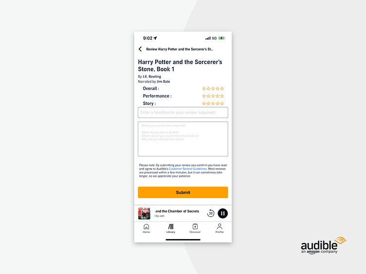
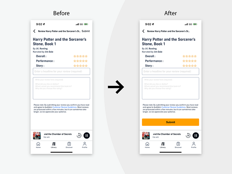
I recently tried to leave a review for an audio book on Audible's app. After I typed out my review I had trouble finding the submit button. The first couple of times I backed out of the screen to see if it was an auto-save feature, but I was wrong. Turns out it was camouflaged at the top, right-hand corner of the screen next to the book title. I propose moving the submit button below the review form, making it more visible and intuitive for users. I believe this simple tweak can make the review process much smoother and enhance user experience. What are your thoughts on this? Do you encounter similar design challenges on other apps?