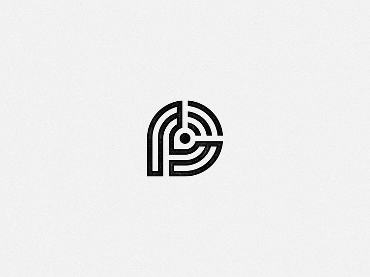
Premier Broadband — unused concept
unused identity mark concept created for Premier Broadband — providing ultra high speed internet services to rural areas across Arkansas
—
The mark is an abstracted letter "P" monogram, created with circuit-like continuous lines; it combines the namesake "P" with the familiar 3-lined wifi symbol, which was a client-requested route of exploration. Combining these two elements in a seamless and symbiotic way creates something ownable out of the familiar, and communicates outward growth and confidence.
—
See the final work here
More by Amy Nortman Holcomb View profile
Like
