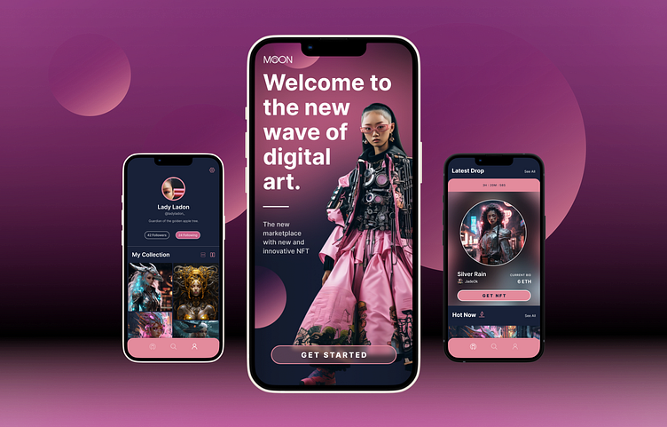
Moon NFT App Case Study - Dribbble UI Course Project
Overview
The startup Moon seeks to develop a revolutionary NFT marketplace app that provides a deeply curated experience for the web 3 audience through a design-first approach. We were tasked with establishing and scaling a visual language across five screens based on a provided series of wireframes. The finalized concept would then be prototyped for presentation to the client and other interested parties.
Conceptualization & Exploration
CONCEPT 01
Concept 01 was cyberpunk in essence, so we drew from inspiration that incorporated dark backgrounds, neon, glow, gradients, and glassmorphism. We were drawn to the purple, orange, and pink tones to with elements that alluded to future and space. We considered Moon’s brand identity, which is a nod to the folk symbolism of a moon rabbit—a future-facing emblem of renewal.
CONCEPT 01 exploration
We decided on deep pinks commonly associated with the cyberpunk aesthetic to form a primary monochromatic palette, which paired well with an accessible font that iterated well.
CONCEPT 02
Concept 02 is dreamy, and is bright, gentle, and soft in essence. This is brought about by the neumorphic design elements, gradients, blurred edges that appear brushed, and smooth curves throughout. Colors are primarily light blues, greens, and white with some bursts of bright hues like orange. We aligned this with Moon’s folklore-inspired brand identity as a moon rabbit, eliciting images of an ever-changing moon that softens and brightens the night sky through the seasons.
CONCEPT 02 exploration
Here we leaned toward a playful aesthetic. By using the blue hues that we were drawn to in the moodboards, glassmorphism, organic shapes, thin strokes, and a wide sans-serif font that conveyed friendliness by way of exaggerated shoulders and short ascenders.
Scaling Design
We went with the Cyberpunk concept, and moved forward with the deep pink-oriented palette. we ultimately felt that the playful aesthetic of the candy-hued second concept may not reach the target audience of established NFT art audience as effectively and not as well-aligned with the brand.
Design System
We went with the Cyberpunk concept, and moved forward with the deep pink-oriented palette. we ultimately felt that the playful aesthetic of the candy-hued second concept may not reach the target audience of established NFT art audience as effectively and not as well-aligned with the brand.
Takeaways
Although this is not my first time using Figma, this is my first time designing an app screen. I have learned through this Dribbble case study experience that there is still so much to learn and harness in this powerful software. I am grateful for the mentorship that has been provided through this highly engaging and accelerated short-form learning module.
Prototype
Link to the prototype can be found here: Moon App Prototype


