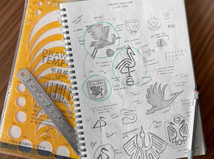
Ballers Sports Club visual identity
Born out of a pandemic-led shortage of outside time for children, Billy started his own football academy that focussed on creating both enjoyable and affordable sessions for youth aged between 5 and 12. He wanted his new identity to feel approachable enough to attract all genders yet professional enough to build trust with parents.
Essential to the redesign was the heron. It featured in Billy’s last logo and was a prominent guest around the parks where he started the academy in Carshalton. After my rigorous research and word mapping parts of my process, I dove into sketching herons in various forms and styles always with an eye on how these would look locked up in a badge. Once I found the style and position I wanted the bird to be in, I jumped onto the computer to refine. I went through over a hundred different versions, all with very minor tweaks until I landed on the perfect execution you see here.
Playing off the angles in the heron, I customised some clean sans serif type tying in with the bird design brilliantly. It made sure that they both felt part of the same family. Blue and yellow were core brand colours of the academy already and so I needed to stick to these in my redesign. I modified the colours slightly so they worked well both on light and dark backgrounds.I absolutely loved working with Billy and the team and Class4KidsUK, fingers crossed I get to work on next year’s competition winner’s brand! Billy was so kind to even send me my own shirt with the logo on, proper good client he is!
Testimonial
“I met Jack through Class4Kids on the back of the 'Level Up Competition'. Having no experience speaking or dealing with logo designers, I wasn't too sure what to expect. I was pleasantly surprised. Jack was very thorough and gives you complete transparency in how he puts together logos based off your business/targets/ideas. This creates the perfect logo as he immerses himself as part of your business to not only create a logo that looks cool, but a logo that creates an identity for your business that stands out. I am so happy with our logo, as Jack took into account how I operate as a business and who I need to appeal to, which then created the masterpiece Jack put together. I can't thank Jack enough, and will certainly recommend him to anyone that requires help building a brand and identity. Thank you Jack.”
Ready to create or refresh your brand's identity?


