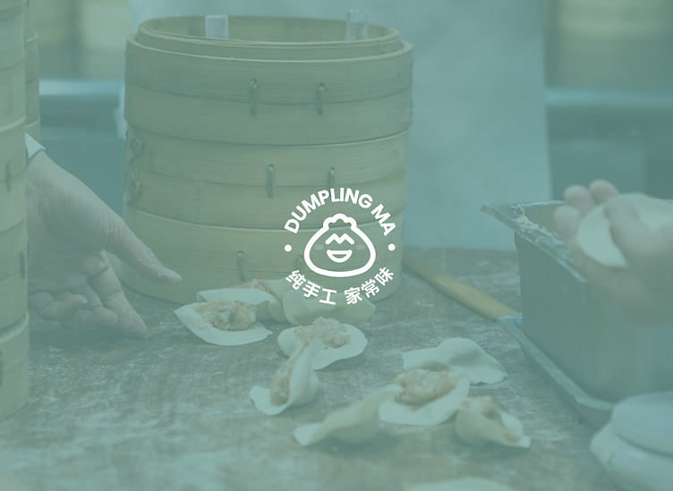
Dumpling MA | Logo, Brand Identity, and Packaging
The Problem:
Dumpling MA's lack of visual identity hindered customers from remembering and sharing the brand with friends and family.
The Solution:
We created a logo that would be difficult to forget; the logo is a mascot and has a visual pun (see logo conceptualization). Additionally, we went beyond the stereotypical red color scheme prevalent in many Asian food brands appealing to American consumers. This unconventional color scheme and clever logo ensure that Dumpling MA is remembered.
Inviting and Playful
The sans-serif font, pastel colors, and smiling logo create an inviting and playful brand identity. Subtle hand-drawn illustrations of various ingredients also give the brand a familiar and homemade feel.
Future-Proofing
Currently, Mei Li's sales are exclusively online through platforms like WeChat. With plans to open a physical storefront, we created mockups of posters, signs, aprons, etc., to meet her future needs.
Enter your text here...
Credits:
James Wu - Logo Conceptualization, Color Scheme, Typography Michael Roberson - Vectorization, Brand Identity, and Mockups


