Rebranding for The Body Mechanic Fl

Rebranding for The Body Mechanic FL
Project Goal
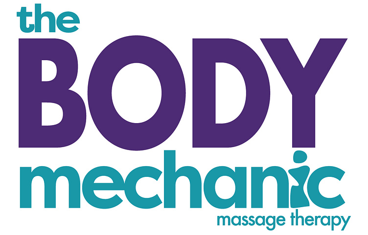
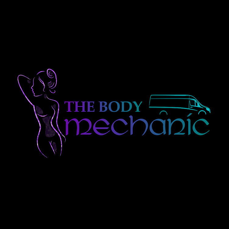
The body mechanic fl was originally just a mobile massage service and has expanded into a physical location. The client was in need of an updated look that was not just restricted to a mobile service. The existing logo was hard to read, the imagery made it confusing to what kind of business it was. After gathering more information from the client we understood the rebrand needed to be clean, legible, and still focus on the existing clientele, with an appeal to attract new clients.
Solution
The project solution was created by streamlining the design of the logo into a legible, balanced, and memorable design. We researched some other massage brands and decided the boldness of the font would be best. The color theme needed to be solid colors and the font needed to be legible and bold. The idea of a body shape included in the brand was a must. After creating some rough sketches with a few variations of the body shape until replacing the "I" became the winner. The client is excited with the rebranding and the new look of the business.