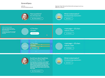
CTAs specs
Call to action units for the bottom of each page of our new website.
The left side is a more traditional “hard-sell” CTA, while the right side is intended to keep the user reading if they’re not yet ready to commit by clicking the left one.
More by Thanx View profile
Like


