NFT App of the Future
Project Overview
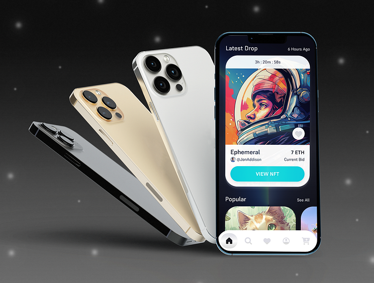
Design Brief: The objective of this project was to design and prototype an app for the client, MOON Co., that showcases the latest digital art within the NFT marketplace. Users can bid on an array of digital artists' work within the app. The app design was created to be clean and simple to navigate so it can clearly represent the art in the growing NFT industry. Target audience was individuals interested in the NFT digital art space. My role in this project was to be the concept developer, designer, and prototyper of the UI screens.
Moodboards
Two completely different art directions where created based off of the futuristic look. I wanted to create this look because the NFT industry is digital and high-tech in itself. Following the 10%-20%-70% colors rule, bright colors for both directions were chosen such as highlight colors along with compatible shades of black, grey, and white. The highlight colors were used to guide users to critical CTAs throughout the app, such as biding on NFTs.
Visual Exploration
Style and visual language included one art direction that looked more futuristic while the other direction looked more modern. Direction 1 "Colorful Wormhole" contained deep dark-to-light gradients, bold type, and a laser teal color for the CTAs. Direction 2 "Organic Purple Mountains" contained a pastel color palette with bold type and less contrast.
Lock & Scale Design
The final visual aesthetic was decided to be the "Colorful Wormhole" aesthetic. This was chosen because it looks more inclusive to all styles of digital art, rather than the "Organic Purple Mountains" choice, which looked as if it would only display vector-based digital art. The selected option also displayed an outer space vibe which appears more futuristic rather than just being typically modern. Dark-to-light gradients and white shadows where repeated throughout the UI screen designs as well as the laser teal color to continue the outer space look.
UI Library
Final UI design system included CTA buttons for following artists, viewing art, and favoriting art. All the UI elements and colors needed to be visible on a dark background to work with the design theme. Subtle layered white shadows where added to the key cards to make them stand out more. One chunky, technical looking font, Supreme, was selected to keep with the futuristic yet artistic outer space theme.
Takeaways & Next Steps
Outcomes & Results: By creating this case study much was learned about designing scalable yet consistent digital products in Figma. The unity with variety design concept was utilized throughout designing each app screen so all the screens looked like one cohesive unit. Ideating themes for product designs was also a skill added to my toolkit. Lastly creating a prototype complete with components that animate allowed myself and other users to view how the app was going to function in the real world before it even enters development. Overall the impact on the target audience was an increase in sales for the NFT marketplace to those who love digital art and love supporting digital artists.


