Alma Foodbank App | UX Case Study
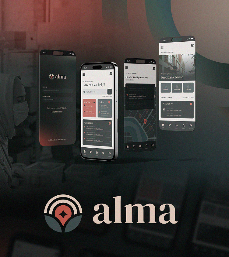
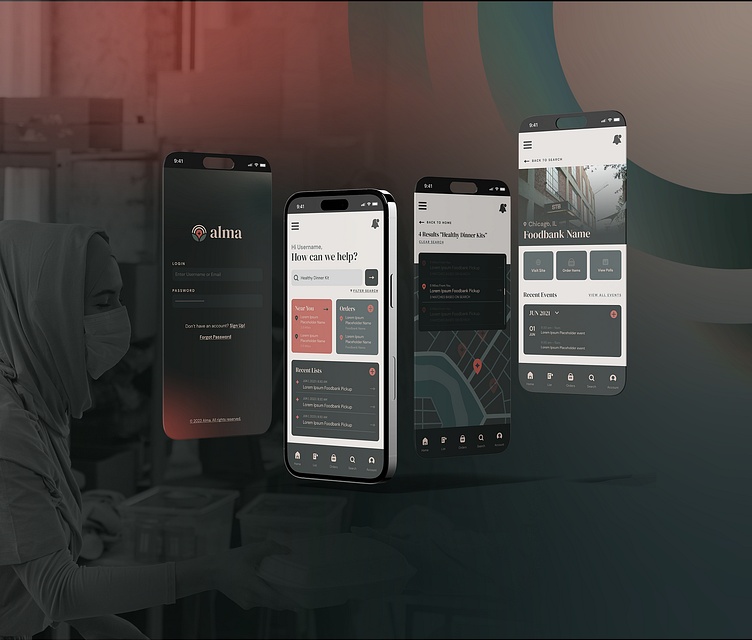
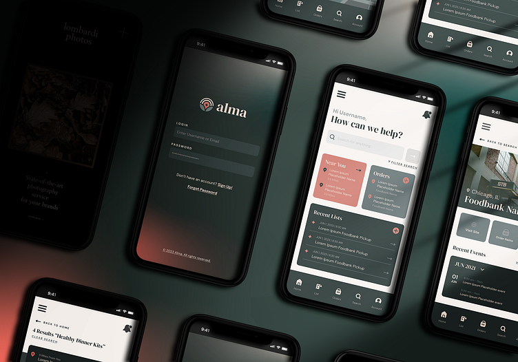
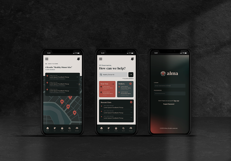
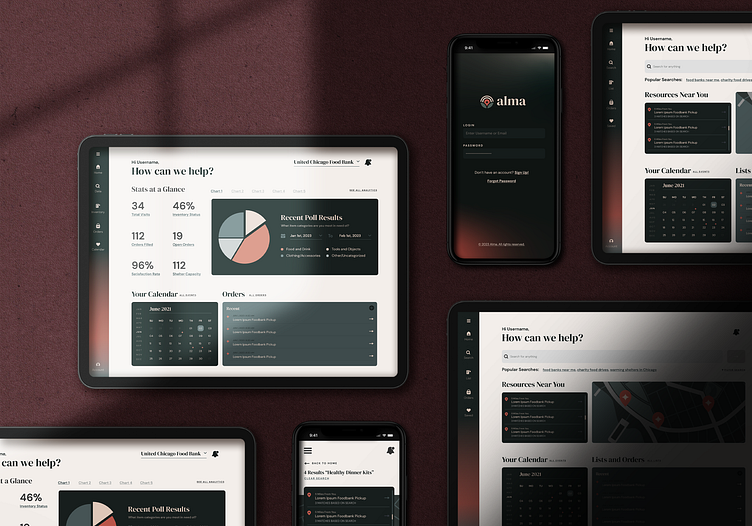
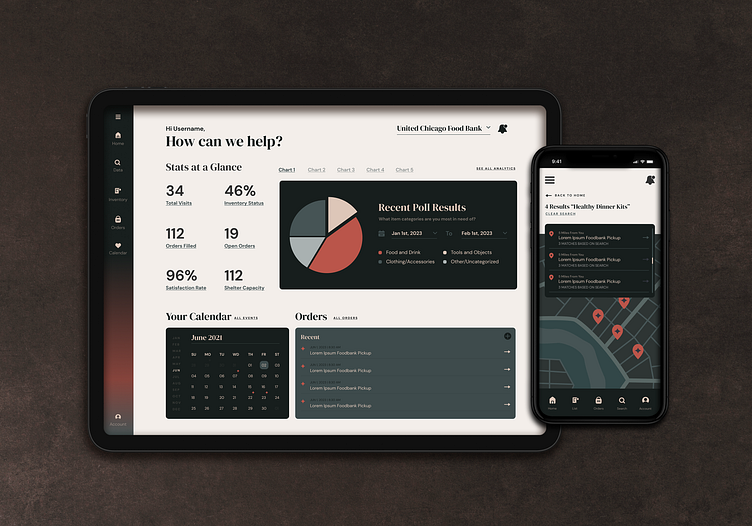
On the surface Alma is an app that connects people to essential resources near them, but more so it’s a way to nourish community. The app is designed for those in need to search for essential resources (food banks, shelters, donation drives, etc), show volunteers opportunities around them, and allows organizations to poll their community about what they really need.
The Name, Alma
The name "Alma" carries layers of meaning. Drawing inspiration from various languages, each contributing to the overall essence of the app. In Spanish, "Alma" translates to "soul," reflecting the intention to connect with users on a deeper, more personal level. In Arabic, Alma is a feminine name, meaning "apple," symbolizing growth, knowledge, and nourishment; essential sustenance for its users. Additionally, in Latin, "Alma" translates to "nourishing," emphasizing the app's commitment to fostering personal development and well-being.
Furthermore, the similarity to the English word "alms" within the name evokes the concept of donations and charity, highlighting the app's focus on giving back and supporting causes. Finally, the euphonic nature of the name, devoid of hard consonant sounds, imbues it with warmth and softness, creating an inviting and comforting impression for users.
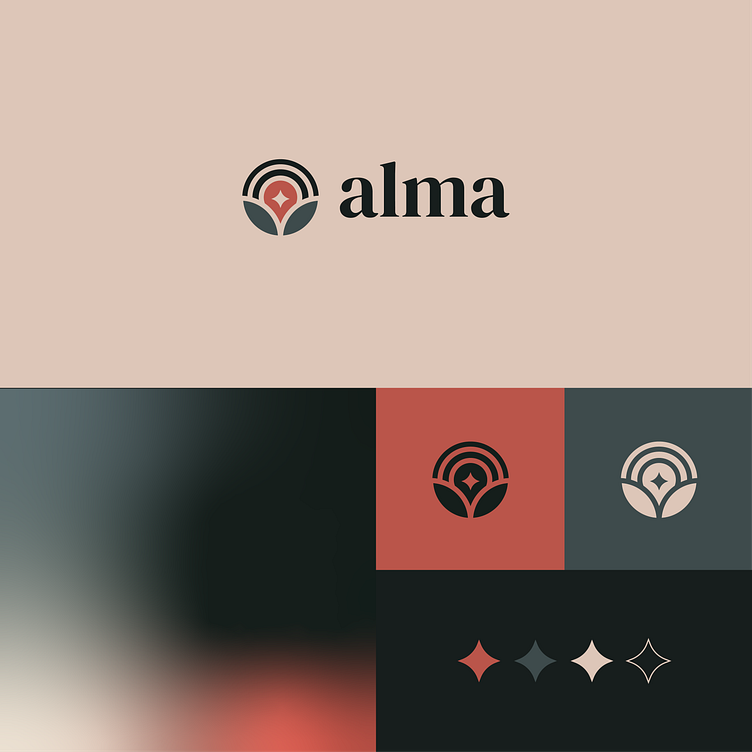
The Logo
The design of the logo is tied to Alma’s purpose of connecting people in need to local resources within their community. The spouting plant represents the nourishment and growth that individuals can experience through accessing the resources available to them. It signifies the transformative power of support and assistance.
The north star symbol encapsulated within the plant embodies the guidance and hope that the app provides to users as they navigate their challenges. It serves as a beacon, helping them find their way towards the right resources and support systems.
The radiating lines surrounding the north star represent the communication and spread of ideas, reflecting the app's role in connecting individuals to a network of resources, organizations, and community members. This imagery symbolizes the app's ability to facilitate information-sharing and collaboration, enabling users to access the help they need.
The elegant yet approachable serif font further emphasizes the app's mission of fostering meaningful connections and providing a user-friendly experience. Overall, the logo effectively communicates the app's purpose of connecting people in need to the resources available in their community, while also evoking a sense of hope, growth, and interconnectedness.