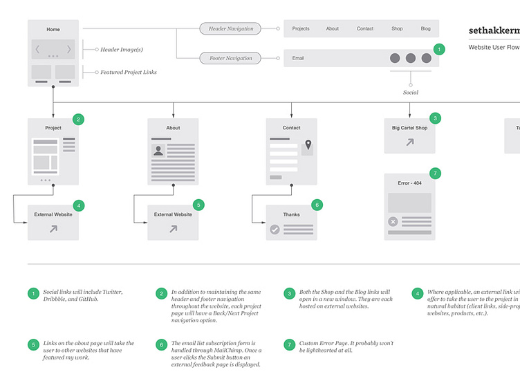
Website User Flow Diagram - sethakkerman.com
The main reason for the redesign was to move my portfolio website from pseudosuede.com to sethakkerman.com. It was time. People had trouble spelling it. I had been keeping written and sketched ideas for a while and wanted to work on my process instead of going from sketches straight to code. My first step was to create this basic user flow diagram. That way I could resolve as many potential roadblocks as I could discover early on in the process and really define what I wanted my new website to be.
My goals for the website redesign:
Cleaner, More Mature Layout Smarter, Cleaner Code Projects: Quality over Quantity Use SCSS (SASS) Diverse Project Documentation Easier to Update Improved Typography High Image Quality
More by Seth Akkerman View profile
Like
