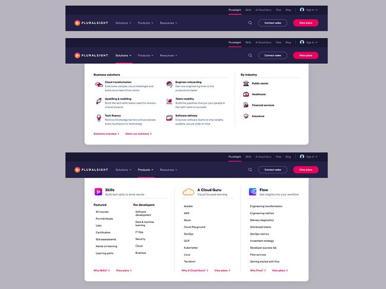
Pluralsight Desktop Nav
A couple favourite dropdowns from the recent redesign of Pluralsight's website navigation. With the redesign, it was very important to improve the user experience, alongside launching a whole new simplified–yet larger–information architecture since the integration of A Cloud Guru.
One of the main features we introduced in order to achieve this was a two-tiered approach to the navigation, where the top navigation dictates which section of the website the user is in, with each of the main navigation bars changing it's logo and architecture accordingly as if each of Pluralsight's products have their own microsite each.
See it live here.
More to follow...
More by Luke Etheridge (Proud Designs) View profile
Like
