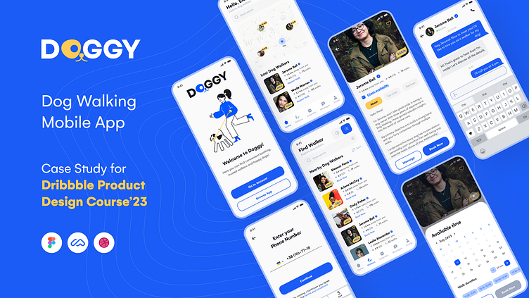
DOGGY: Dog Walking App Case Study
👋🏻 Hello Everyone!
I am Elena, a Product Designer based in Kyiv, Ukraine. I am passionate about design, and I believe in the importance of continuous learning. That's why I am always eager to take courses to improve my skills.
In 2023, I took the Product Design Course at Dribbble and I want to showcase the projects I worked on during it.
Over 16 weeks, I immersed myself in the intricacies of Product Design, further expanding my understanding of the field from different sides.
The course gave me additional insights, tips, and tricks that have helped me further develop my skills with Figma and Design Systems.
I learned how to make more efficient UX research. These new skills have enabled me to create exceptional digital products.
Thanks to my mentors Valerie Downs and Jesse Showalter, for for helping me grow professionally.
♾️ General Flow of Product Design Process
📝 Design Brief
The goal was to develop a mobile app that connects dog owners with dog walkers, providing a convenient and reliable way to get the help they need to care for their beloved pets when they have no time.
The app was designed to instill trust in dog owners by ensuring that their furry companions would be in secure hands.
Project Timeline:
🤕 Problem Statement
🔍 Research
User Research
I have used various user research methods to gain a deep understanding of our users, including:
🔹 Conducted in-depth interviews with dog owners to understand their needs and preferences for dog walking services.
🔹 Administered surveys with dog owners to collect data on their preferences, pain points, and trust in others with their dogs.
🔹 Analyzed publicly available data to understand general trends, demographics, and behaviors of dog owners.
🔹 Used analytics tools to track and analyze online discussions about dog ownership, dog walking services, and trust.
Market Research
Conducting a competitive analysis by researching and comparing the top five competitors' apps is a great way to gain insights into the market and identify areas for improvement in our dog-walking app.
By understanding our competitors' strengths and weaknesses, we can make informed decisions to differentiate our app and provide unique value to our users.
Comparison table
User Persona
💡 Ideation
During this stage, it is important to brainstorm and outline ideas for the product.
This includes generating and documenting concepts, features, and potential solutions that meet the identified user needs and goals.
〰️ User Flows
In the course, I focused on designing user flows for the onboarding process and finding a dog walker based on user needs and research.
Onboarding Flow
Finding a Dog Walker Flow
📐 Wireframing
At this stage, our primary goal is to define our interface's fundamental structure and layout. We focus on determining the placement of key elements, defining user interactions, and establishing the overall navigation flow.
🎨 Visual Design
Color Scheme & Naming
The app's color scheme was chosen to be blue and yellow for several reasons.
Blue is often associated with trust, reliability, and calmness, which aligns with the app's goal of establishing trust and providing a sense of security to users.
Conversely, yellow is a vibrant and energetic color that can evoke enthusiasm and excitement.
This choice of color creates a balance between a sense of trust and a dynamic user experience. The combination of blue and yellow in the color scheme aims to create a visually appealing and engaging interface while highlighting important elements and calls to action within the app.
The name "Doggy" was chosen for the app because it reflects the core focus and purpose of the application, centered around dogs and their care. The name is simple, catchy, and easy to remember, making it accessible and relatable to dog owners.
App Screens
🛠️ Scaling Design & Prototyping
Design System
Once the primary screens were created with unique styles, a design system was developed to provide guidelines for typography, color palettes, icons, buttons, and other UI elements.
The design system empowers teams to create screens more quickly and efficiently, ensuring consistency and speed throughout the design and development process.
Prototyping
I created a testable prototype for user testing before the development stage.
This step allowed us to gather valuable user feedback before investing time and resources into building the final product. By incorporating user feedback early on, we could make informed decisions and refine the design to ensure a more successful and user-centered end product.
👩🏽💻 User Testing
I used usability testing to identify and address several weaknesses in our application to improve it.
🚀 Final Words
To sum up, this project was instrumental in refining my UX research and user-testing skills and enhancing my proficiency in using Figma.
Previously, I relied more on Sketch, but this project helped me to consolidate and expand my skills, enabling me to achieve better outcomes with Figma.
It also emphasized the importance of thorough testing before development, which can save time and resources.
Thanks, Dribbble, and I highly recommend this course to anyone interested in product design.
The course is well-structured and covers many topics, including user research, user-centered design, prototyping, and testing.
I learned a lot from the course, and it would be a valuable resource for anyone who wants to improve their product design skills.
If you are looking for a UX/UI that can help you create a product that your users will love, feel free to contact me: elenadissi87@gmail.com


