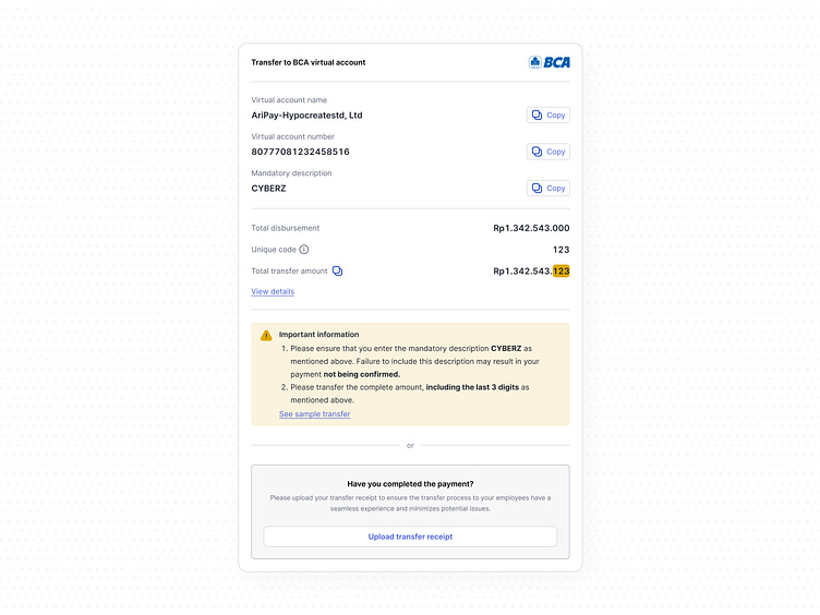
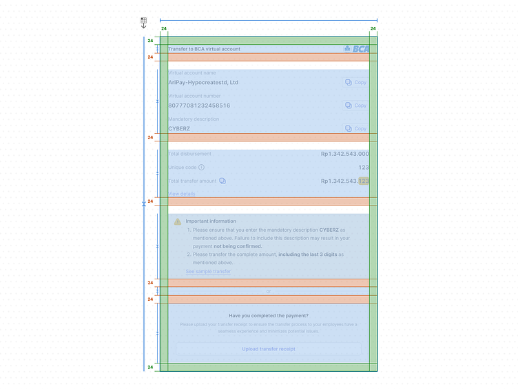
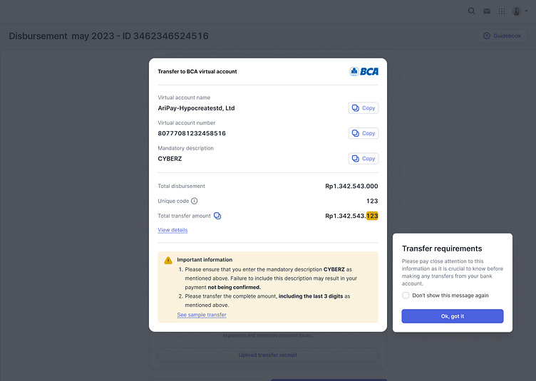
Transfer instruction details
Hey all,
Sharing further insights from the collaboration together with our team. We got tasked to revamp payroll disbursement in the whole process, with an aesthetic preference and a high focus on maximizing usability and accessibility. But for this case, the main focus is on how to reduce human error when the transfer process.
What the problem is?
Since payroll disbursement was released a year ago, we have received a lot of issues/complaints from our users. In short, they said that when they wanted to do the transfer, when inputting the VA number, exact amount, and so on is incorrect. so we have to do the reconciliation process and of course, this has an impact on delays in payroll employees.
The challenge is?
How to increase user awareness toward the transfer instruction and make them feel urgent to read the requirement.
Possible solutions
how might we make it more visible and being focus for the user at that time
The result: an optimized user experience to add kinda onboarding screen to user in the last step and add the trigger to user if understand. This will always show and if the user feel bothers just ticked the checkbox.
Are you looking for someone who can help you solve these problems? looking for a professional and experienced UI/UX designer? and need custom website development?
We have 4+ years of experience in this field of UI/UX Design (Web and mobile). We have done several projects related to revamping web development.
Services we provided:
— Website Development
— UX/UI Design
— Graphic Design
— Design System
----------------------------------------------------------------------------------------------------
Thanks for scrolling!
We are available for new projects.
Hit me, pixelbyari@gmail.com