NFT Marketplace Case Study
Problem Statement
The new NFT marketplace app should make shopping for NFTs easy and fun. The individual NFTs should be easily to browse through, and selected for more information and larger viewing.
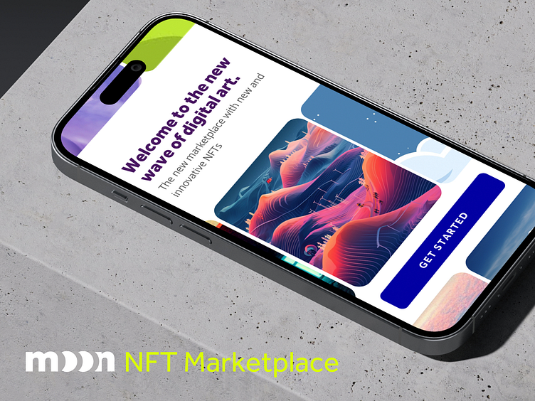
The visual aesthetic should communicate the personality of the app and the brand of the app, which is fun, young, contemporary, and just a bit edgy. The visual aesthetic should consistently run throughout the app screens. Include a UI Library of the final UI and a functional prototype.
Users and Audience
The audience for NFTs is general is tech savvy people who want to collect and share digital art. This App should appeal to a young audience, but an audience that knows what they want. They want the App to look and feel professional and yet very much with the current trends.
Moodboard
I started with gathering samples for a moodboard that could serve as inspiration as I created the App. I gravitated towards a flat look with rounded corners that accentuates the feel and modularity of the cards and images of the NFTs. The feeling of flipping through cards is transmitted. Bright colors with high contrast strengthen the concept.
Sketching
For me the best most natural way to explore rough initial ideas and options is through sketching on paper. I really enjoy the process as it is quick, but the process of drawing also takes time that can be used for contemplation and reflection. Putting pen to paper has a innate relaxing effect.
Outcomes and Takeaways
Often NFTs are quite detailed. Of course the NFTs are the main attraction of this App, so the few distractions from the NFT artwork the better. I utilized a very crisp and clean look for this reason. Additionally, large image size to show the NFTs is better, including for browsing through the thumbnails. This is especially true since the NFTs are often very detailed.
Bold colors fit with the visual aesthetic of the young target audience. Bold colors also help distinguish the UI elements amidst the busy and colorful NFTs.


