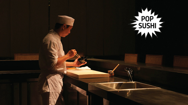
Pop Sushi
Objective:
Pop Sushi is foremost a captivating poster series designed to redefine and challenge the traditional aesthetics associated with sushi restaurant interiors. Departing from the minimalistic and serene environments typically found in such establishments, Pop Sushi embraces a vibrant, loud, and chaotic visual language inspired by the energetic and overloaded nature of Japan's pop culture. The aim was to create a striking and unconventional identity for sushi that captures attention and breaks away from the expected.
Design:
Pop Sushi is a bold contrast to the typical sushi experience by embracing an explosion of colors and visual overload. The poster series is divided into two versions: a daytime series and a nighttime series, each capturing different moods and atmospheres. The design principles are also adapted to various formats, such as postcards and stickers, ensuring versatility and cohesion across different mediums. The combination of sushi illustrations, bold colors, dynamic text orientations, and playful pop-up bubbles creates a distinctive and memorable look.
Key Design Elements:
Sushi Illustration:
Each poster prominently features a simplified, flat, and visually appealing illustration of a type of sushi. These illustrations serve as the centerpiece of the design, drawing attention and adding a playful yet refined element to the chaotic visual style.
Distinctive Bold Color:
The use of bold, distinctive colors is a hallmark of the Pop Sushi series. Each poster is dominated by a specific color that creates a strong visual impact and unifies the overall design. Each sushi type has a specific color scheme. The chosen color either complements or contrasts with the sushi illustration, enhancing the poster's vibrancy.
Price and Color of Different Sushi Plates:
The posters include detailed pricing information for different types of sushi, with colors corresponding to the pricing tiers, like in running sushi.
Horizontal and Vertical Text:
Both horizontal and vertical text to introduce dynamism and a sense of movement. This interplay between text orientations adds to the chaotic yet structured aesthetic.
Pop-up Bubble:
A playful pop-up bubble is incorporated into each design, adding an interactive and whimsical element.
Each sushi poster has a combination of all these key design elements, creating a distinctive look.


