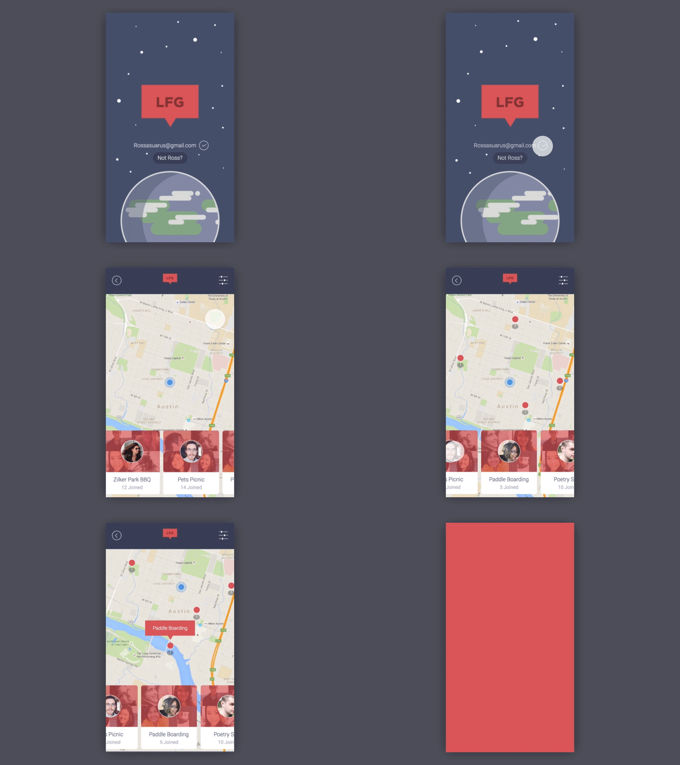
Entry Screen for Social App
Observation: There are a few meet up applications out there, but I think there are no app experiences that really match the value of stumbling across group activities in progress and being invited to participate them.
In this exploration, I drew inspiration from applications like Lyft, Okcupid and event based apps to craft a group meet-up experience centered around spontaneity and location.
Lyft, provides a service on demand when you need it and Its experience is centered around a map, thus my landing page is a map view thats shows in progress group activities in a user's immediate vicinity. Okcupid has great filter options that would allow a user to find exactly the kind of event they'd enjoy partaking in.
The interaction depicted shows a user selecting a paddling boarding group about to set off.
Made with Origami and Quartz Composer.
