ActiveLife Scientific Infographic
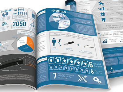
I created this infographic for ActiveLife Scientific to help them show the impact of what they're accomplishing with their technology. It's one thing to read a fact, and another to study a graph, but when you put them together in a design that's easy to understand, it accomplishes so much more.
View the full version: http://www.activelifescientific.com/wp-content/uploads/2014/12/IntroducingActiveLife_12022014.pdf