Roger Federer - The Maestro
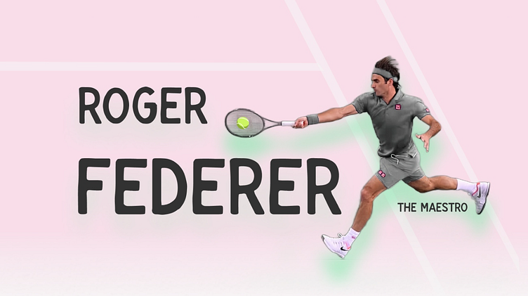
The Meastro
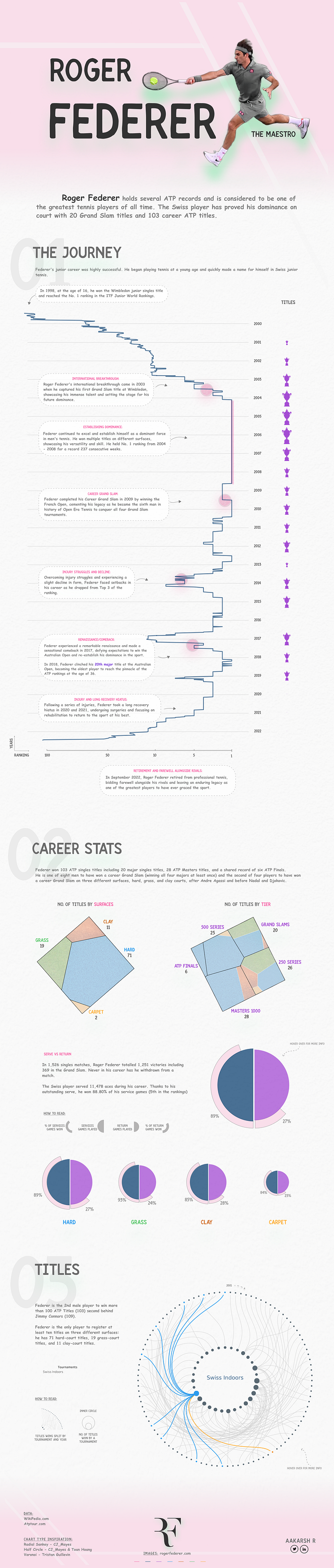
This is the Data Visualization on Roger Federer, one of my favorite athlete and also one of the Greatest of All Time.
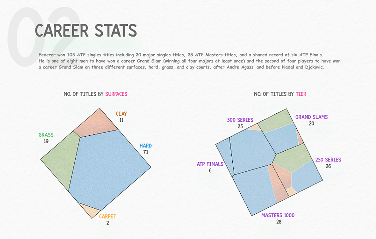
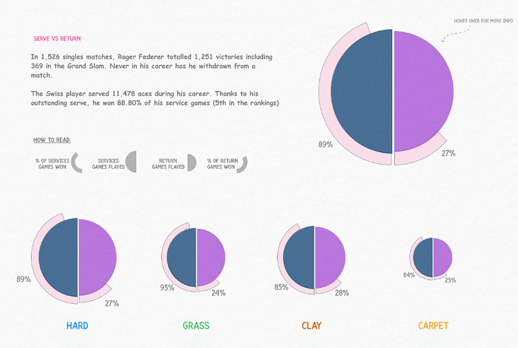
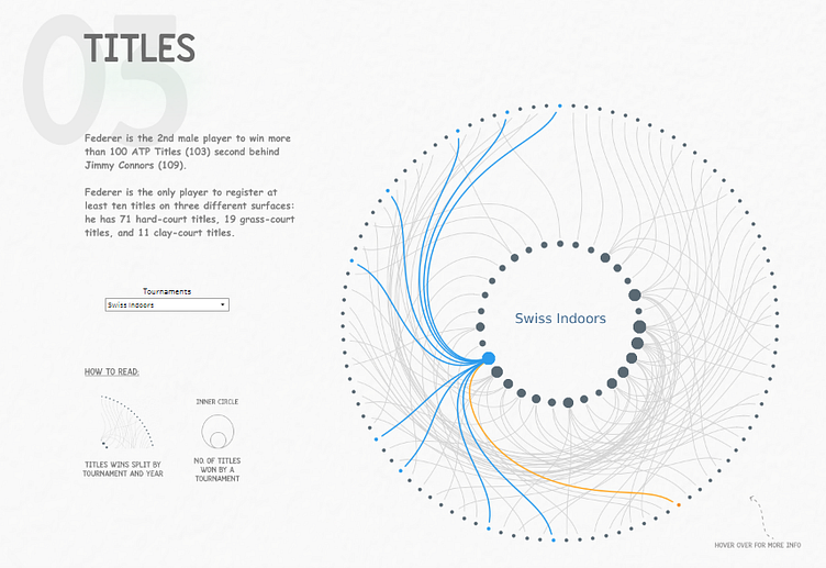
This visualization is a work of art that combines a variety of interesting graph types. It comprises of two Voronoi squares (one for surface/court and other for Tier), and also the split doughnut/circle graphs for serve and return. This helps to visualize something complex - not only the number of games served and returned on each surface, but also the percentage of points won on serve and return games. There is so much to consider and combine.
Data Visualization:
Complete Viz View
Data: Wikipedia & AtpTour
Viz and Design Tools: Tableau & Figma
Viz: Tableau Public
Designed By: Aakarsh R | @aakarsh_r
