IZEA Rebrand WIP - Rejected #3

Some fun, condensed, inline lettering.
Just one of the typefaces for IZEA's rebrand (yep—we've created more than one) that didn't make the cut.
Take a closer look at the attached, if you want.
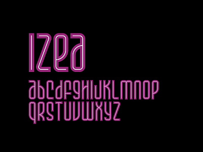
Some fun, condensed, inline lettering.
Just one of the typefaces for IZEA's rebrand (yep—we've created more than one) that didn't make the cut.
Take a closer look at the attached, if you want.