UX/UI Case Study Redesign for “National Park Service”
The National Park Service (NPS) is a prestigious organization entrusted with the preservation and management of national parks in the United States. This case study presents a conceptual redesign exercise for the NPS mobile application, aiming to enhance the user experience (UX) and user interface (UI) design. It's important to note that this case study is conducted without official endorsement, and the redesign is purely conceptual.
Case Study: Redesigning the National Park Service Mobile Application
About the Redesign: The purpose of this case study is to present a conceptual redesign for the National Park Service mobile application. The current design suffers from an outdated user interface (UI) that doesn't effectively showcase the beauty and significance of the national parks. The goal is to create a modern and user-centered design that enhances the user experience (UX) and encourages visitors to engage with the National Park Service.
The Challenge: The primary challenge of this redesign is to create a mobile application that seamlessly integrates the vast amount of information about national parks while providing an intuitive and delightful user experience. The existing UI is cluttered, making it difficult for users to navigate, discover relevant content, and plan their park visits effectively.
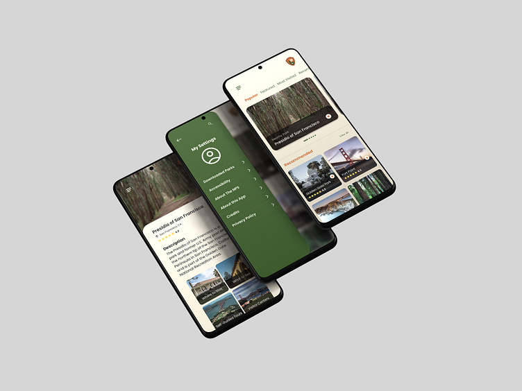
Solution: The proposed solution involves a complete overhaul of the UI to create a fresh and engaging design. The focus will be on simplifying the navigation, improving information accessibility, and incorporating interactive elements that foster a sense of exploration and adventure. The new design will prioritize usability and visual appeal while aligning with the National Park Service's mission and brand identity.
UX Review: The current UI lacks a clear visual hierarchy and suffers from a cluttered layout. The navigation is confusing, making it challenging for users to find relevant information quickly. The lack of engaging visuals and interactive elements hampers the overall user experience. To address these issues, the new design will prioritize intuitive navigation, visual storytelling, and streamlined information architecture.
Old Design vs. New Design: The old design featured a static homepage with an overwhelming amount of text and links. The new design will introduce a visually captivating homepage that showcases stunning imagery from various national parks, inspiring users to explore further. The navigation will be simplified, with clear sections for park information, visitor resources, events, and educational content. Interactive maps, immersive photo galleries, and personalized trip planning tools will be incorporated to enhance the user experience.
Approach and Process: The redesign process will follow a user-centered design approach, involving the following steps:
Conduct user research to understand the target audience's needs, preferences, and pain points.
Perform a competitive analysis to identify industry best practices and gather inspiration.
Develop user personas and user journey maps to guide the design process.
Create wireframes and interactive prototypes to test and iterate the design concepts.
Collaborate with developers and stakeholders to ensure the feasibility and alignment of the design.
Implement a responsive design that caters to a seamless experience across various mobile devices.
Context Study: In-depth research will be conducted to understand the context in which users interact with the National Park Service mobile application. This includes studying user demographics, their motivations for visiting national parks, and the specific information they seek while planning their visits. By understanding the context, the design can be tailored to meet user expectations effectively.
Target Audience: The target audience for the redesigned mobile application includes both existing park visitors and potential new visitors. This includes individuals, families, and educational institutions looking for information about park locations, activities, events, and educational resources. The design will aim to cater to a diverse range of users, including different age groups and levels of technological proficiency.
Workflow: The redesigned mobile application will provide a seamless workflow for users, from initial park discovery to trip planning and on-site navigation. Users will be able to browse through parks, view details such as park highlights, hiking trails, and camping options, create personalized itineraries, and access real-time information during their visit. Push notifications and location-based services will be integrated to enhance the overall experience.
What I've Learned: Throughout this redesign process, I have learned the importance of balancing aesthetics with usability. Creating a visually appealing design is essential to engage users and evoke their interest in national parks. However, it should not come at the cost of a seamless user experience. It is crucial to prioritize information accessibility, intuitive navigation, and clear calls-to-action to ensure that users can easily find what they need and make the most of their park experiences.
Conclusion: The conceptual redesign for the National Park Service mobile application aims to address the existing challenges and provide a modern, user-centered design. By simplifying the UI, enhancing the visual appeal, and improving information accessibility, the new design will encourage visitors to engage with the National Park Service, explore park offerings, and plan their visits more effectively. It is important to note that this case study is purely speculative and does not imply any official endorsement or collaboration with the National Park Service.
Disclaimer: This case study is a conceptual exercise and does not represent an official redesign endorsed by the National Park Service. The ideas and designs presented are purely speculative and intended for educational purposes only. The National Park Service's official website and mobile application are separate entities, and any actual redesign would require collaboration and approval from the appropriate stakeholders.
