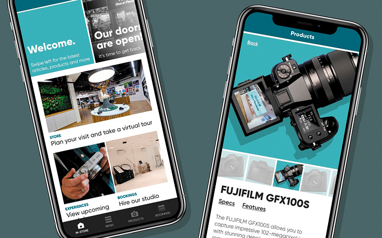
Fujifilm (UK) House of Photography companion app
Two years on from it’s opening night, how can the House of Photography companion app better suit the store and it’s customers? What should the goal of the app be? How can it serve customers visiting the London store?
Project responsibilities
• User Research: User interviews, user journey mapping, site & IA mapping
• UX Design: Sketching, wireframing, prototyping, UI design & usability testing
Project context
• Summer 2020 - 3 weeks
• Lead UX/UI designer, working closely with the dev team
Tools used
• Sketchbook
• Adobe XD
• Adobe Illustrator
• Hive & MS Teams
Account registration feels like a barrier
The app had been out for over a year at this stage and we had gained a lot of feedback on user journeys throughout the app, a major hurdle for most users was the need to create an account (and log in) in order to access content.
This stemmed originally from the plan to integrate the House of Photography with Fujifilm’s global warranty program; Connect, with an eventual aim to build e-commerce into the app. The store needed customers to physically visit, and make purchases on site rather than online and the decision was made to remove the need for a user account. Instead I worked increasing the accessibility of the bookings feature within the app - the store frequently host events and workshops, has a large gallery and has studio space available to customers - allowing me to remove required user registration from the app and, more importantly it promoted visiting the store itself.
No ‘home’ within the app
Upon logging into the app, users were dropped within the news feed and although this learnt from the user - adapting to display stories related to the content they read - becoming more tailored feed, it didn’t give the user any hint as to the full range of features available within the app and didn’t drive the user directly towards visiting the store.
Adding the additional step of a home page to welcome users and give a summary of everything the store had to offer, with (exclusive) booking through the app as well as the articles/news stories would reframe the app, positioning it as a companion to the store rather than a separate entity that would occasionally reference the store. I added a carousel at the top of the page, functioning as a nod towards the old news feed, highlighting news, updates and events - thus giving the client an opportunity to further promote key content to their audience as well as latest news and promotional offers - a set grid of features sat below the carousel giving quick access to store focused content along with the functionality to book events and hire studio space and equipment.


