Online Hearing Care
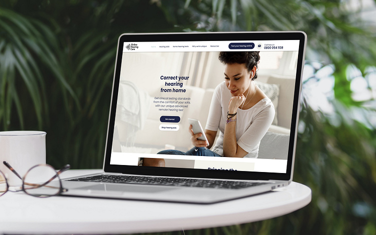
Developers of a home based hearing test, capable of delivering accurate audiograms, how can OHC’s underperforming website better serve it’s audience and provide support through the hearing aid purchase experience?
Project responsibilities
• User Research: Auditing, user journey mapping, site & IA mapping
• UX Design: Wireframing, prototyping, UI design & usability testing
Project context
• Summer 2020 - 3 weeks
• Lead UX/UI designer, working closely with the developer and a content creator
Tools used
• Sketchbook
• Adobe XD
• Adobe Illustrator
• Hive & MS Teams
Cleaning up the journey
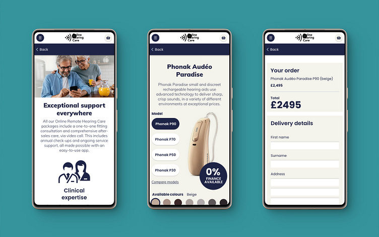
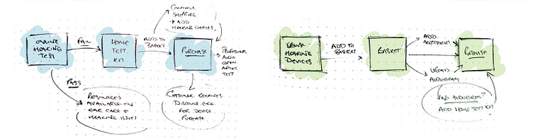
Looking at OHC’s existing site shed some light on where problems could be cropping up. Users where typically funnelled towards doing an online hearing test which, if flagged concerns should point them towards the home testing kit and the beginning of a purchase journey with a discount being applied towards a hearing device should they order the test kit.
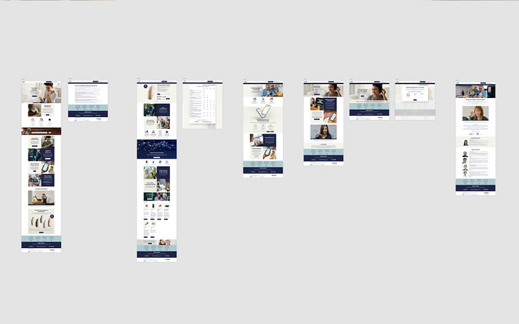
It wasn’t working that way in practise though, upon completing the online test user’s where getting lost on the site and failing to complete purchases. I reworked the site map based on some common user journeys created to cover the various pathways available, refocusing the site, creating a more obvious structure to where content lived and ensuring that ordering a home test kit - as that marked the first step of their purchasing journey - was accessible, easy and felt reliable/reputable from the moment they landed.


Brand update
As a designer that cut his teeth designing primarily for print - before apps even existed - how colour is used across a design, a product or whatever has always drawn my interest. The brand guidelines had room for a lot of complimentary colours that didn’t have enough contrast between them to work together. This wasn’t a rebranding exercise, but I decided that it was important to add a little more diversity into the colour pallet, adding a supporting colour of beige (#F4F4EC) that worked with the existing light and dark blues and remove the magenta altogether as it was only serving as something that was difficult to read.
I took this a step further and decided to replace Kumbh Sans and Montserrat with the Google font, Poppins. Going with a clean, unfussy approach to the site’s typography reducing text styles across the entire site.