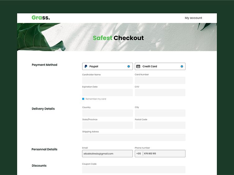
Checkout Concept for Grass
Hello Everyone !
This shot presents a web checkout flow for the new Grass ecommerce platform. The minimalist, intuitive single-page design aims to create a smooth purchasing process for customers shopping for plants, gardening supplies, and more.
Soft green themed UI elements reinforce the botanical brand identity. Clean layout and hierarchy make navigation effortless. Details like the chatbot provide guidance while custom illustrations add charm.
The checkout strikes a balance between simplicity and playfulness to craft an engaging yet efficient shopping experience. Let me know your feedback!
More by Reda Elbakkali View profile
Like
