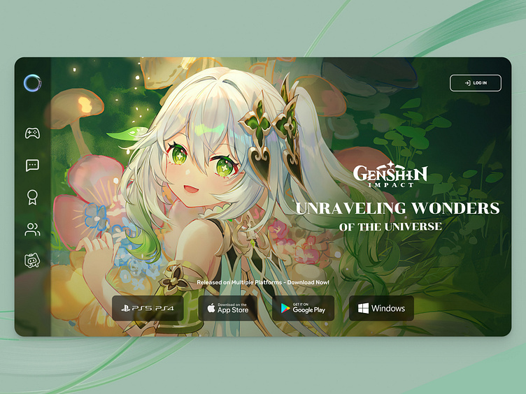
Genshin Impact - UI Website
Hello everyone!👋
I am glad to present to you my latest creative work - redesign of the main screen for the official website Genshin Impact. I thought that the first screen in the original is very overloaded and redesigned it in the style of the game, using the side menu and icons instead of words. Since the game site is likely to be visited by players, they will quickly orient themselves, and the image of the cute Dendro Archont will make everyone players smile.
Press "L" if you like it ❤️ Thanks!
Got ideas? Let's discuss!
Follow me:
My Behance | My Instagram | My Facebook
Freelance/Collaboration - anastasiia.valentin@gmail.com
More by Stacy Khomynych View profile
Like
