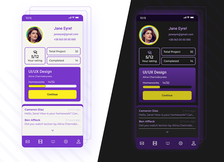
User page for online learning resource
Please rate the light and dark themes of the user page (mobile version) for the online learning resource.
And which theme do you like more?)
You can view other works in my portfolio.
Thank you for viewing!
More by Oksana Tverdokhlib View profile
Like
