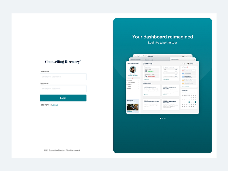
Admin panel
Our admin panel for members is looking tired. We have been doing minor updates and having to find space for new features by doing this we are causing problems for our users, the biggest one being user not able to find core sections.
This is how the admin panel currently looks for a paid member. This initial page is the only place a user can see new feature alerts, set their status and view their profile. We need to improve visibility of alerts to users going forward.
Site map
Once the sitemap was laid out it was really clear that we had been using 'My profile' to store too many sections. We needed to split this up and form a proper navigation for the admin panel. We also felt we had enough space on screen to not rely on a section called more to house random features we didn't know where to put. This site map had been neglected for just too long.
New layout
We wanted to move away from the admin panel looking like a website, we wanted it to have a feel of a dashboard and be really clear to any user it was separate. The navigation got a new home (Hooray!). New features. announcements would sit here so they were visible on all pages.


