Fujifilm (NA) Exposure Center
Two years on from launch, how can I improve the user’s experience with the Exposure Center platform? And, with 50% of site visitors viewing the site on mobile, can we upgrade that experience to better match that of the desktop site?
Project responsibilities
• User Research: Competitive/comparative analysis, user journey mapping, site & IA mapping
• UX Design: Wireframing, prototyping, UI design & usability testing
Project context
• Spring 2020
• Lead UX/UI designer, working closely with the developer and a content creator
Tools used
• Adobe XD
• Adobe Illustrator
• Hive & MS Teams
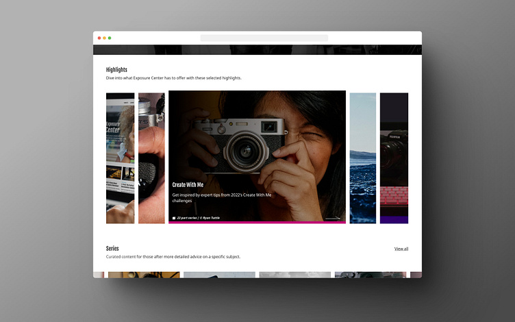
Content pusher, feature facilitator
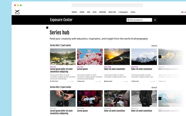
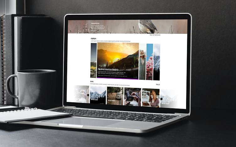
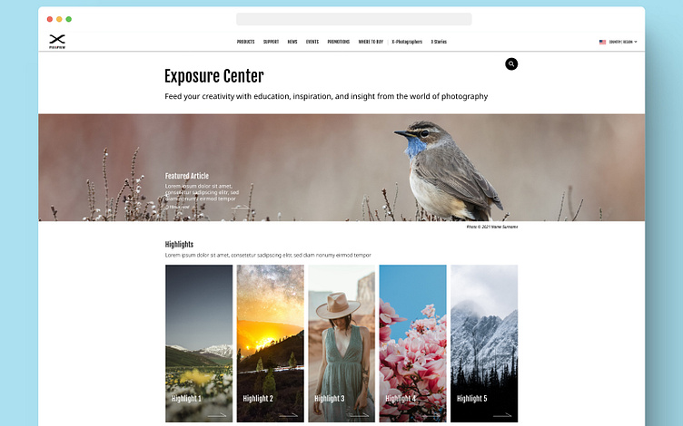
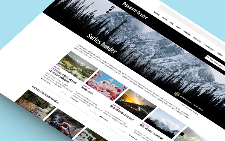
The client was keen to improve the experience through the introduction of new features, essentially adding new access points or ‘ways in’ to the huge resource of content within the site. This would boil down to two new features, ‘Highlights’ and ‘Series’.
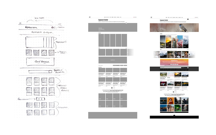
I had completed a lot of comparative research for the original build of the Exposure Centre, looking at how high levels of content were presented to a user, categorised and filtered within site like Medium as well as mainstream news sites like BBC and The Guardian. This gave me a good understanding of how to structure and order the page, drawing on their practice of creating great experiences for their users to help steer some early decisions, “if it ain’t broke…” as the saying goes!
What I needed to add with ‘highlights’ was something far more attention grabbing, for this I looked at streaming sites. Netflix’s ‘top 10…’
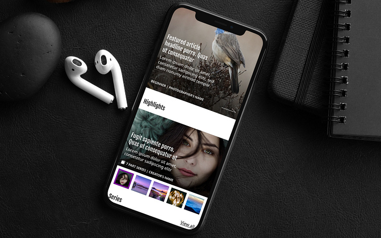
Parity for mobile and desktop
The first build of the Exposure Center had been stripped back for mobile, many desktop features had been removed and the site’s mobile experience was streamlined in order to push the user into content as quickly as possible, I didn’t have a great deal of access to stats from the client’s site, where the exposure centre would sit within, so I wasn’t sure how desktop vs device would come into play with this type of content as it would be new to their users.
Treating that original build as a ‘beta of sorts’ allowed me to get data on exactly how the site was being accessed by it’s users - there was an almost 50/50 split device to desktop and this reflected on how may of the existing features were being used - this meant that with the update I was able to take an informed ‘mobile first’ approach to the new features being added to the site. Working with the dev team to ensure that functionality going into the site had to work no matter the platform, kept the design accessible and consistent no matter what the user’s platform of choice for accessing the content was.